NOTICE: You are in the old ClientSpace Help system. Please link to the new ClientSpace Help here https://extranet.clientspace.net/helpdoc/home/ClientSpace.htm
Business Intelligence
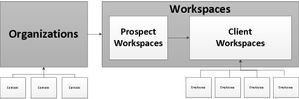
Understanding the Data:
One of the most important parts of writing reports is to understand the data you’re building it with. Here is a high level view of how the data is structured in client space:
What data can you see?
You will have access to a select number of custom views that have been developed for your use. To start out you’ll have access to the ClientSpace data.
What is a view?
A view is a specific grouping of data from tables in the database. These views will have data grouped together that is related to each other to relieve you of the need to understand the data table relationships. We have included a number of views as part of our CORE and PEO packages fore reporting use - for more info on these views and what information is contained in them refer to CORE View Listing and PEO View Listing.
Using Business Intelligence:
Getting started:
- Sign into ClientSpace.
- You can either add the Business Intelligence Reporting module to your header links or you can access it through the full list of modules.
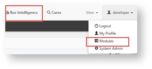
- Highlight the module and click “Goto” to open the module.
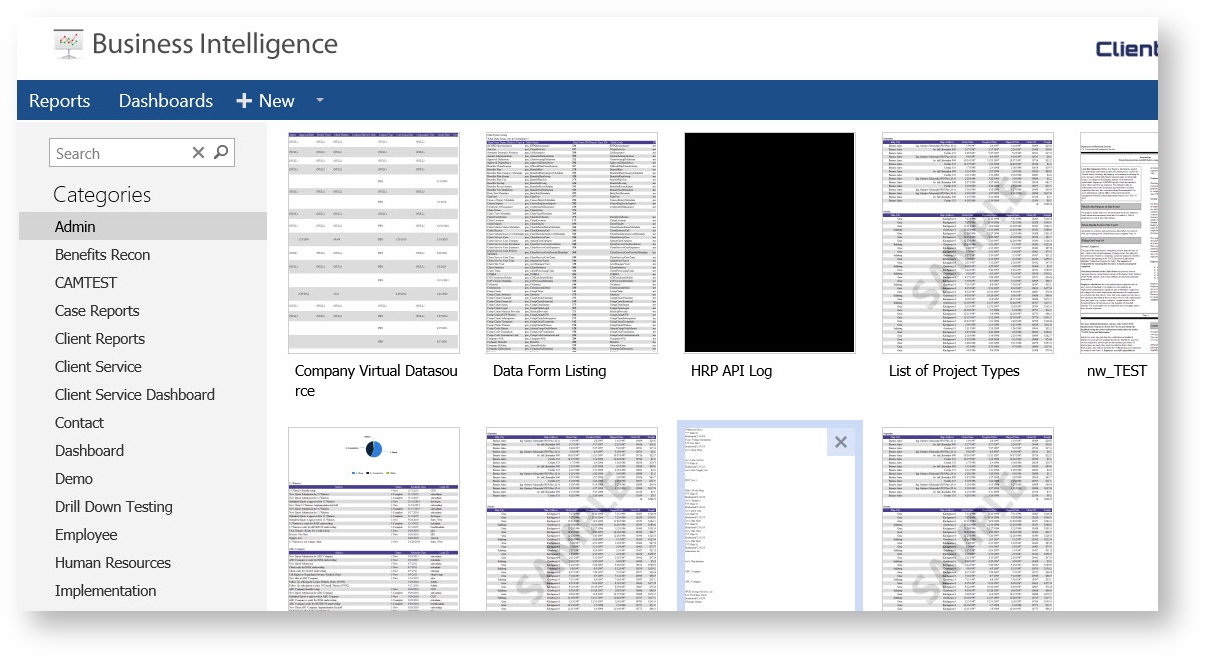
- This will bring you to the list of reports to which you have access.
Run the report, Design the report, or Add a new report.
Building a new report:
Before you begin - a word about JOINS:
In order to connect the data in your ClientSpace installation for use in a report the tables must be joined together. The following image describes common joins used in SQL server to connect tables:
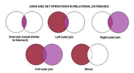
For the purposes of BI reporting in ClientSpace we will only deal with a few of these:
Inner (Direct) Join: Selects rows from two tables such that the value in one column of the first table also appears in a column of the second table. This is one of the most common joins used in reporting.
Cross Join: A cross join will return a result table where each row from the first table is combined with each row from the second table.
Left(First Exists) Join: The Left Outer Join known also as Left Join returns all rows from the left table in the Left Outer Join clause, no matter if the joined columns match. A field in a result row will be null if the corresponding input table did not contain a matching row. This is the second most common join used - Inner and left joins will make up the majority of the joins necessary to connect ClientSpace data.
Right Join: The Right Outer Join known also as Right Join returns all rows from the right table in the Right Outer Join clause, no matter if the joined columns match. A field in a result row will be null if the corresponding input table did not contain a matching row.
Full Join: The Full Outer Join known also as Full Join returns all rows from Both the Right Outer Join & Left Outer Join. A field in a result row will be null if the corresponding input table did not contain a matching row.
Work through the tabs.
Data Sources Tab:
Select your data source. This is the list of views that you’ll have access to choose from. We have designed these views in a manner that you’ll only need to select one at a time. NOTE: A view is a set of tables that have already been joined.
The Data Sources tab shows which tables and views are already stored in the database. Also provides a choice of which table to view or which tables you would like to join. To join two tables and/or views, they must have fields with identical entries.
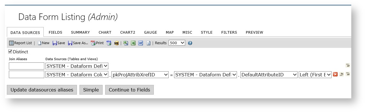
- The Table dropdown menu is a list of the tables and views available to the user. Select the desired table/view to preview. To join multiple tables or views that have a field with identical entries, select those tables/views.
- The Join Field dropdown menu is a list of the fields contained in the table/view selected in the Table dropdown menu to the left. Select the field that has identical entries as the table/view that it needs to be joined with.
- The Foreign Table dropdown menu is a list of the tables/views that have been selected in the Table dropdown menu, other than the one in that row. Select the table/view to join the table/view in that row.
- The Field dropdown menu is a list of fields in the table/view that are selected in the Foreign Table dropdown menu to the left. Select the field to join with the table/view in that row.
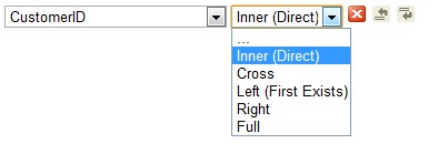
- The Join Type dropdown menu is a list of the available joining methods. The “Inner” method discards any objects from the joint fields that do not have an identical match. The “Left” method still displays those without an identical match.
| Icons | Control Name | Description |
|---|---|---|
| Delete button | Click this button to delete the row the button is on. |
| Insert Row button (above) | Click this button to insert a row above the row the button is on. |
| Insert Row button(below) | Click this button to insert a row below the row the button is on. |


Fields Tab:
The easiest way to get started it to use the Quick Add.
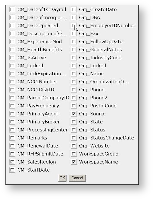
Select the desired fields and click ok.
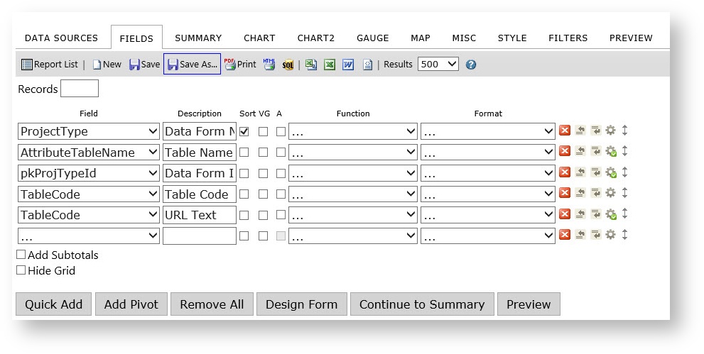
Once you have the selected the desired fields you can perform a number of tasks, including changing the field’s label in the Descriptions column, changing the order, visually grouping (VG) and sorting.
The Field dropdown menu is a list of the available fields in the table/view that is selected in the Data Sources tab. If joining tables/view, the title of the table/view that the field is from appears in parenthesis next to the name of the field. Select the fields to display. The entries in the list that are in Bold are the table/datasource names.
The Description field is the title of the field when the table/view is displayed.
Sort, Group, and VG Check Boxes and Functions dropdown menu features.
Features | Description |
|---|---|
Sort check box (a-z) | Check this box if you want the table/view to be sorted by the field selected in the Field dropdown menu to the left in ascending order. |
Sort (z-a) | This check box is in the advanced properties of the row and can be set if you want the table/view to be sorted by the field selected in the Field dropdown menu to the left in descending order. |
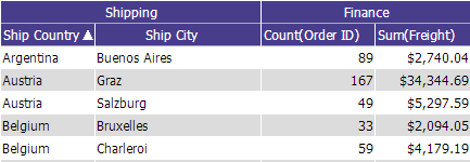
VG check box | Check this box to change the column for the field selected in the Field dropdown menu to the left into subheadings |
| A | Arithmetic – Performs basic calculations (+, -, x, %) and concatenation of text. |
Function dropdown menu | Functions can be chosen from the dropdown menu. If the Group option is selected a group of fields can be created. See Function Descriptions for more information. |
The Format dropdown menu is a list of formats for the entries of the field selected in the Field dropdown menu directly to the left to appear in.
Format | Examples | |
|---|---|---|
Short Date | 8/1/1996 | |
Long Date | Friday, August 09, 1996 | |
Short Time | 12:34 AM | |
Long Time | 12:34:56 PM | |
Full(short) | Friday, August 30, 1996 4:34 | |
Full(long) | Wednesday, October 23, 1996 2:28:37 AM | |
D&T(short) | 3/12/1996 7:45 PM | |
D&T(long) | 2/27/1996 12:45:13 AM | |
The function buttons are for the rows that they are in.
Control Name | Description |
|---|---|
Delete button | Click this button to delete the row the button is on. |
Insert Row button (above) | Click this button to insert a row above the row the button is on. |
Insert Row button (below) | Click this button to insert a row below the row the button is on. |
Move | Allows user to move a row up or down in the list. When moving a field you have to use the blue bar to guide where you are placing it. |
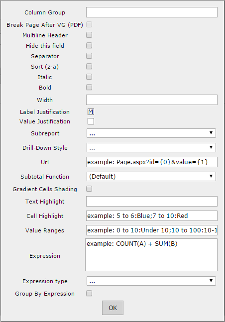
Advanced Properties++ | Advanced field settings provide more granular control over what data is displayed in your report. They can be accessed by clicking on the gear icon to the right of any row on the fields tab or the summary tab in the report designer. There are a number of options that can be selected here. For more information on using Advanced properties click the expanding section below. |
Advanced Settings
| Setting Name | Description |
|---|---|
| Column Group | Applies a label to this column that can work over multiple consecutive columns. Any other column that shares the same label will be included in the grouping. |
| Page Break After Field | If 'Page Break After Field' box is checked and this field is also a visual group, then it will trigger a page break in a printed report every time this field has different value. |
| Multiline Header | 'Multiline Header' allows a header to be multi-lined if the length of the header is longer than set width of the column. Each space between words works as a line breaker |
| Hide this field | Hides the field from display when report the is ran. Useful for using expressions on multiple fields but when only one of the fields should be displayed. |
| Separator | Breaks out Analysis Grid by this field. Functions identically to VG in a normal table. Since VG is used to define the hierarchy of the Analysis Grid, Separator should be used to visually group the Analysis Grid. |
| Sort (z-a) | Sorts in descending order |
| Italic | Sets whether the column is shown in italics |
| Bold | Sets whether the column is shown in bold |
| Width | Set the width of the column in number of pixels |
| Label Justication | Sets the Column label to the left, right, or middle of the row |
| Value Justication | Sets the Value of the field to the left, right, or middle of the row |
| Subreport | Sets the drill-down child report. The list contains only reports that have a drill-down key set for them. Note: The "Automatic" option will attempt to choose a sub-report by matching the drill-down key to the selected field and cannot discern between two sub-reports that use the same drill-down key. |
| Drill-Down Style | Link – opens in same browser window Link (New Window) – opens in new browser window Embedded – embeds the drill-down results into the main report Popup – opens the results on a pop-up screen Hover - Shows the sub-report when you hover the mouse over the item that the sub-report is linked to ComboKey - Used in combination with one of the above. When this setting is chosen for the second drilldown key, the value of both fields will be passed from the main report to the sub-report. Header Link - Used in a pivot to pass the value of the header (a value derived from the grouping of the pivot header column) to a subreport. Additional values from the left side of the pivot can be passed using ComboKey, or can be incorporated and hidden into the pivot itself. . |
| Url | Allows you to define a custom Url to redirect to when the value in this cell is clicked. |
| SubTotal Function | Sets a customized function for subtotals displayed with this field. The default value is "Sum". This only applies to the bottom sub-totals and not the side sub-totals. If set to 'Expression' then a box will appear allowing you to set an expression for the subtotal. This functions in the same fashion as the typical expression box. |
| Gradient Cells Shading | Sets whether cells will use a gradient or solid colors for shading. The larger the value in the cell is, the darker the shading will become. This gradient is determined by establishing a range of x to y, where x is the lowest value in the column and y is the highest, and shading them proportionally where x will be the lightest shade and y the darkest. |
| Text Highlight | Highlights the text for a given range. You can refer to the Styles tab for a list of valid colors or using an RGB hex code such as #ff0033. Syntax is given in the format a to b:color;c to d:othercolor:e to f;anothercolor and so on. For example: "5 to 6:Blue;7 to 10:Red". A colon is used to separate the range and value, semicolons are used to separate pairs of range:value arguments. A value given without a range after the first range:value pair acts as a conditional, for example: "1 to 10:Red;Blue" would color values between 1 to 10 red, and everything else blue. A range may be a single value. You may also use percentages to establish a range, such as 0% to 20%:Red.NOTE: It is easy to end your statement with a semicolon like this: "1 to 10:Red;11 to 20:Blue;" This will throw an index error! |
| Cell Highlight | Highlights the entire cell for a given range. This follows the same rules as text highlight. You can use both cell and text highlight at the same time to provide contrasting colors, for example if you change the cell to a dark color you might change the text in that cell to a lighter color. |
| Value Ranges | Lets you set text values for number ranges. (i.e. setting this to 0 to 10:Under will display the text "Under" when it encounters a value between 0 and 10 for that column). This follows the same rules as text highlight. |
| Expression ** | Allows you to define a customized mathematical or SQL expression to show as the value for the column cells. |
| Expression Type | Allows you to specify the data type of this field. This is most useful when you are generating output with an expression and need to specify a data type. |
| Group By Expression | If checked, this field will be included in the group by statement of the query. This is functionally the same as the Group function, except applicable to expression output within a field rather than to the field itself. |
** Using Expressions for subtotals - When using expressions to produce subtotals or other mathematical functions it is important to know the mathematics are calculated AFTER the original rowset is rendered, so the table/view field name no longer is valid and the field label selected in the report must be used. For example:
You have two fields on a reports, the column names returned from the datasources tabs are PC_GrossPayroll and PC_TotalEmployees.
When you add the fields to the report you change the names to Annual Wages and WSEs.
To calculate average wages in an expression on the Advanced settings tab you would use the expression SUM([Annual Wages]) / SUM([WSEs])
Features | Description |
|---|---|
Quick Fields From Dialog menu | List of tables/views selected in the Data Sources tab. |
Add Pivot | Allows the user to add a pivot table to a report |
Continue to Summary | Allows the user to advance to the Summary Tab |
Preview | Allows the user Preview the current report. |
Once you have finished, you can Continue to Summary tab or Preview the report.
**For the purpose of this documentation I will be continuing through the tabs but keep in mind that once you have your fields selected you can preview the report at any time. This will allow you to make the report look exactly the way you want through trial and error.
Summary Tab:
On the summary tab you can select which field you would like to summarize.
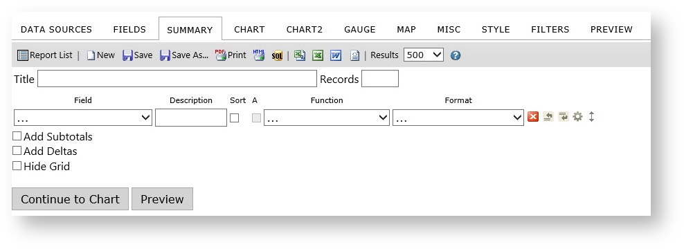
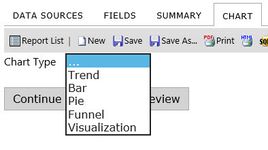
Chart Tab:
On the charts tab you can select which type of chart you would like to use. For this report we’ll use the pie chart.
You can then adjust the Chart setting to your liking.
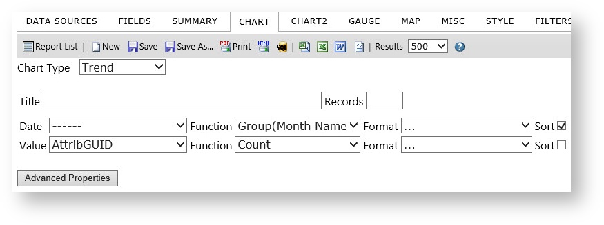
Trend Chart:
Features | Description |
|---|---|
Trend chart | By choosing chart type Trend, the chart appears in Trend format. |
Date dropdown menu | Choose any field of date format like birth date, join date, and so on. |
Value dropdown menu | Choose any value from the dropdown list. |
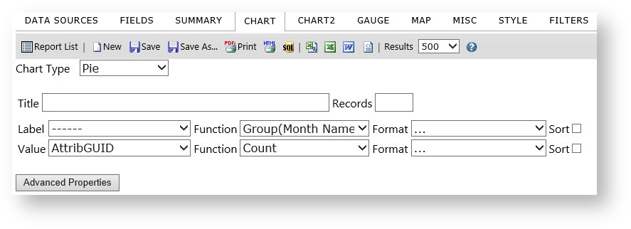
Pie Chart
Features | Description |
|---|---|
Pie chart | By choosing chart type Pie, the chart appears in Pie format. |
Label dropdown menu | Choose any label from the dropdown list. |
Value dropdown menu | Choose any value from the dropdown list. |
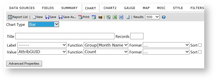
Bar Chart
Features | Description |
|---|---|
Bar chart | By choosing chart type Bar, the chart appears in Bar format. |
Label dropdown menu | Choose any label from the dropdown list. |
Value dropdown menu | Choose any value from the dropdown list. |
Funnel Chart
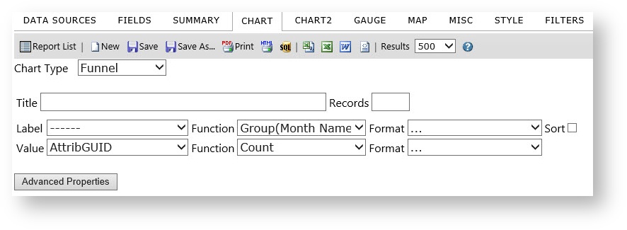
Features | Description |
|---|---|
Bar chart | By choosing chart type Bar, the chart appears in Bar format. |
Title | Insert name for the chart |
Label dropdown menu | Choose any label from the dropdown list. |
Value dropdown menu | Choose any value from the dropdown list. |
Gauge Tab:
Just like on the Chart Tab you can add panel or radial gauges to the report for any data you like. Use the preview tab to get just right.
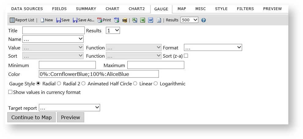
Results: Allows you to specify how many gauges you want to show, if you choose to count the number of products in multiple categories, you could specify that you want to only show the first 4 categories by alphabetical order.
- Name: Choose the gauge labels
- Value: Chose the field to which a function is applied.
- Function: Choose a function to apply to the field.
- Radial/Linear: Outputs a different style gauge.
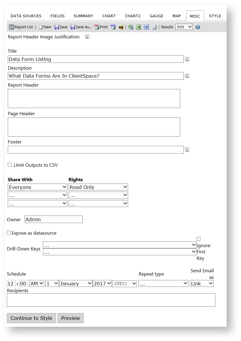
Misc Tab:
Here you can edit the Report header, description, and footer. This is also where you will adjust the permissions of the report. By default reports are not shared with anyone. This will allow you to build your own list of reports. To share a report select a role from the drop down list and then select the right you wish for that group to have. Please note that is the users you are sharing with do not have permissions to the data you are sharing they won’t be able to see the report.
1.0 Exposing reports as a DataSource
Izenda BI reporting allows you to create your own Datasource Reports with the check of a checkbox using the "Expose as Datasource" checkbox. It is a best practice to insure that the output of any Datasource report contains a foreign key that can be JOINED to other tables / Views in the main report.1.1 Drilldowns and Subreporting
To create a drilldown report, you can start by designing the main report, but in order to be able to select a drilldown report, that subreport must first have a drill-down key to show up in the selection list. This means it often makes more sense to work from the ‘bottom up’, from the lowest subreport to the highest parent report.
A subreport will not appear in the list of available subreports until it has a drilldown key defined. Once this has been set and the report saved, any other report will be able to access the subreport in the list of available subreports. At this point you can define a drilldown style to control how the subreport is accessed.
Select the Drilldown Type
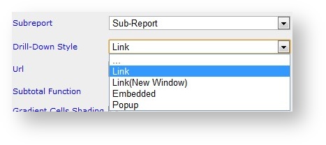
Option | Description |
|---|---|
. . . | Disables the drilldown without removing the link between this field and a subreport |
Link | Opens subreport in the same browser window |
Link(New Window) | Opens subreport in a new browser window |
Embedded | Embeds subreport in the table cell or directly into a form |
Popup | Displays subreport in a pop-up window. You must click on the popup to clear it from the screen. |
Hover | Shows the sub-report on the same screen as an overlay when you hover over the current field, chart, or gauge. |
ComboKey | Indicates that this drilldown key is a second, third, or other key that is not the first key. The first key controls the drilldown style, and every other field with a target subreport and the ComboKey behavior defined will pass their value along with that first value, in field order. |
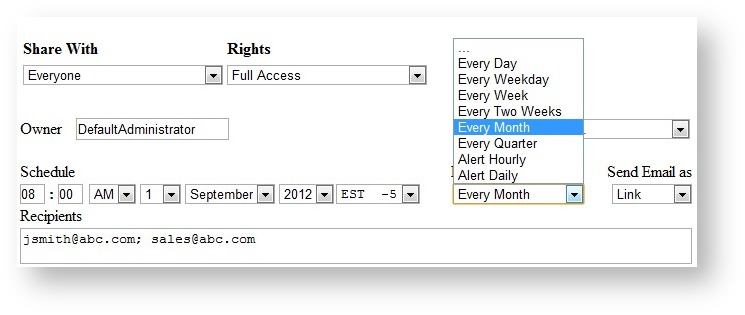
1.2 Scheduler
The scheduling controls may not be available to all users.
If you do not see them, please speak with your system administrator.
Schedule: Set the schedule date and time.
Repeat Type: Set the repeat frequency.
Send Email As: Set the format in which the email is sent.
Recipients: Enter a comma separated list of recipients.
Style Tab:
The style tab is where you can further adjust the look and feel of the report. You can change the color of the border, header, and rows. One of the more common tools on this page is the ability to adjust the order in which the report items displays. Use the preview tab to get just right.
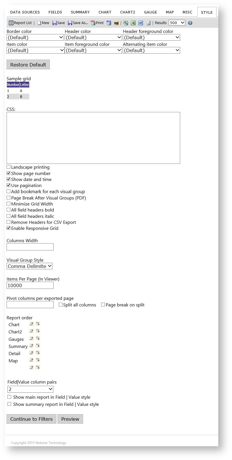
- Report style properties can be changed using the drop-downs, when the properties are changed, the sample grid below can be used to see the differences.
- The colors which can be changed are: Border color, Header color, Header foreground color, Item color, Item foreground color, and Alternating item color.
- Explanations of other properties found on tab are given below.
- Landscape printing: Determines whether the report prints in landscape mode. (It can also be set using print properties in the printer dialogue box)
- Show page number: Sets whether the page numbers are shown in pdf report exports.
- Show date and time: Sets whether the date and time are shown in pdf report exports.
- Use pagination in web view: Sets whether pagination is used in the report viewer.
- Add bookmark for each visual group: Sets whether bookmarks are used in adobe pdf exports.
- Page Break After Visual Groups: Set page breaks for each visual group in pdf report exports.
- Minimize Grid Width: Minimizes the grid width in Preview mode.
- Visual Group Style: Sets whether the visual group labels are shown.
- Items per page: Allows a user to set the number of items show per page in a grid.
- Report order: Allows the user to set the order of the Summary, Chart, Gauges and Detail grids
- Field|Value column pairs: Allows a user to set the field value style. This is useful for Accounting/financial reports.
- Show main report in Field | Value style: Allows a user to set whether the main detail grid uses Field-Value style.
- Show summary report in Field | Value style: Allows a user to set whether the summary grid uses Field-Value style
Filters Tab:
Here you can filter the data using field selector and operator tool. If you leave the “Param” box checked you will be allowed to adjust these filters when running the report. This is useful when sharing a report and only giving read rights.
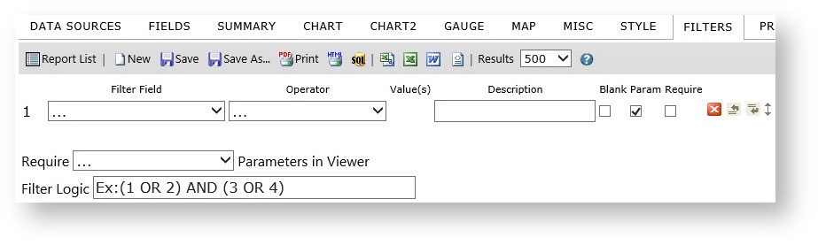
For a more detailed discussion of BI filters and how they work refer to Business Intelligence Report Filters.
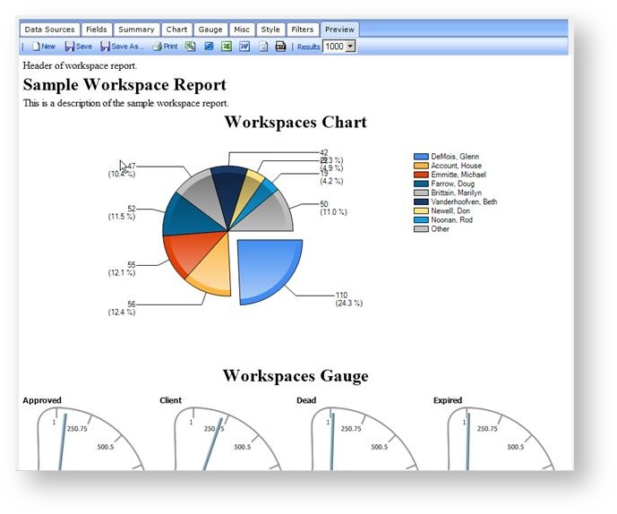
Preview:
Allows for a brief preview of the report - defaults to first 500 rows. Filters that would be adjustable at runtime are not visible in Preview mode.
Save or export:
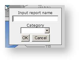
You can save the report to your list of reports. Keep in mind that the lists of categories are global, so please do not add new unless it is a must. Please use the ones already there.
Izenda Reporting Deep Dive
For in-depth information on Izenda reporting, review the Izenda reports wiki.
NOTICE: You are in the old ClientSpace Help system. Please link to the new ClientSpace Help here https://extranet.clientspace.net/helpdoc/home/ClientSpace.htm